A Logo is Born
Back in the day, I wanted to be a graphic designer. Well, truthfully I wanted to become a lot of things, and also truthfully, I still wouldn’t mind being a graphic designer. In college, much to my parent’s horror, I switched majors from pre-med (all those years of dreaming of being a pediatrician died somewhere in the large, overcrowded freshman science classes) to advertising with the intent of going into design. Somehow, somewhere, I got sidetracked and while I did graduate with a degree in communications as an advertising major, I never got much into the design side of things. My first years of working were, in fact, at big advertising agencies, yet in the media number-crunching side of things. And then five years after working in advertising analyzing audience numbers and such, I switched careers entirely and became a school teacher (being in love with a die hard Texan and wanting to be able to work anywhere he lived, I ditched the ad business). That was nearly thirty years ago. But my itch to create and design still exists.
When we started this venture into the vineyard and winery, those long ago suppressed urges to design came back to life. I could design our logo! Our labels! Business cards, social media posts, menus—so much of my creative side awakened with abloom. But where to start? Logo, obviously. I’m a firm believer that a solid logo is the most international way to connect with consumers (hello Nike). If I could come up with a simple, eye-catching design we’d be on our way.
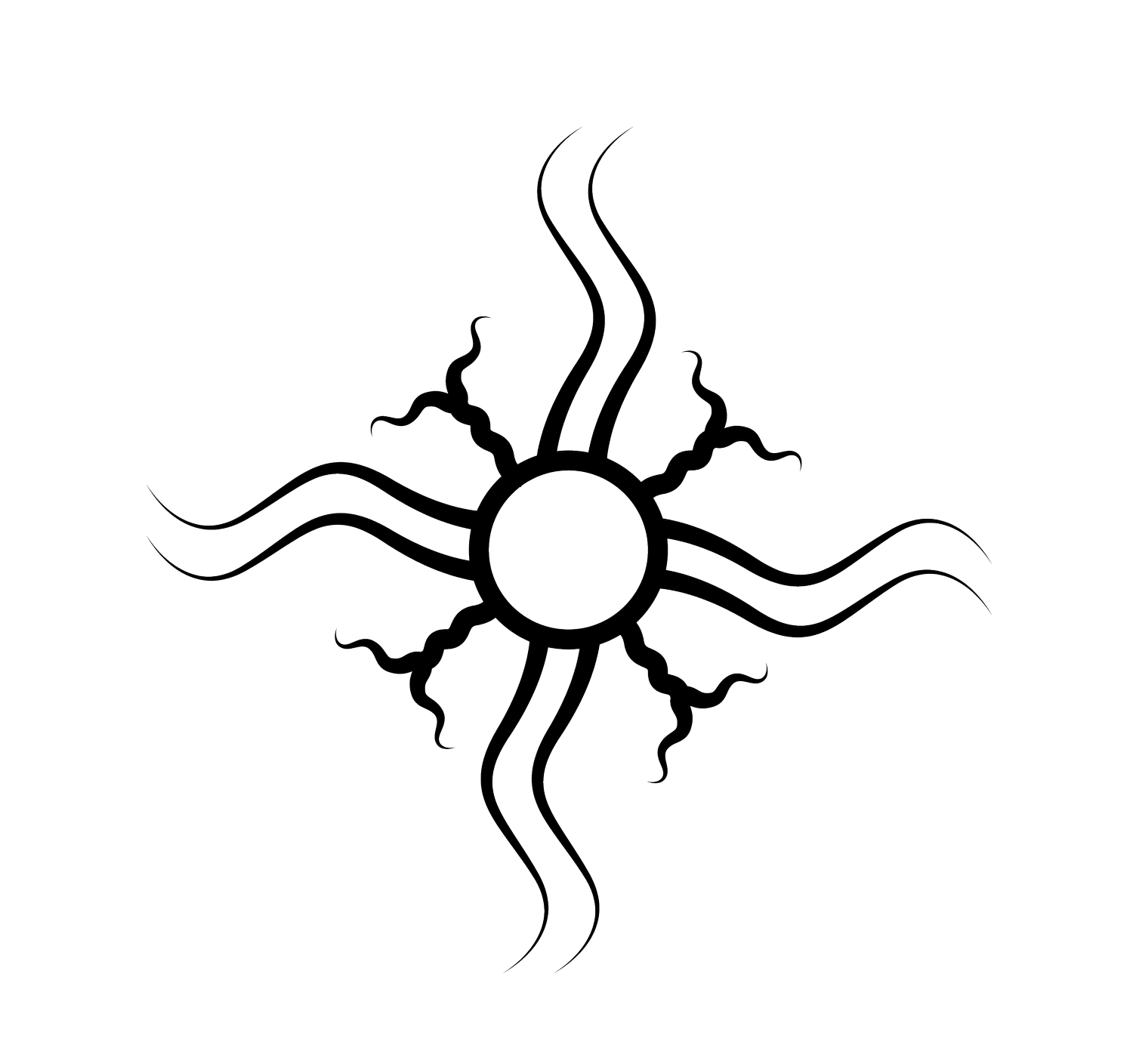
Sol Invictus being the official sun god of the later Empire of Rome, it seemed important to start with a sun. If you just google sun design images, you’d think all the designs are done. What could I possibly do differently? That’s when I thought that grapevines could be the rays of the sun—seemed they could work.
After a few doodles though, I felt like we needed to alternate short and long rays. I then drew a wine bottle, then a vine, then a wine bottle, then a vine, and so on. And I played with the proportions of sun center and length of bottles, bottles and length of vines, etc. until I felt good about the logo. But since this property has the Tinguiriirica river running alongside the east property line, Tony and I thought we should change the logo to include the river. Besides, the wine bottles looked clunky and heavy and needed to go. Again, I fiddled with weights of the lines and size of the center and all those things before settling on one in the middle of all of them.
And then it was just a matter of how to make the design digital. Admittedly I struggled here. A lot. So, I enlisted the help of logotypers.com who in a day turned my hand drawn design into the beautiful logo we use today. Simple, eye-catching, and all the parts have meaning. I’m rather proud of it. Maybe I missed my calling… :-)